RED BULL FILM PACKAGE - ART DIRECTOR
I was invited to pitch on a graphics package for film produced by Red Bull Media House. I came up with 2 distinct options in an attempt to answer the brief.
Brief
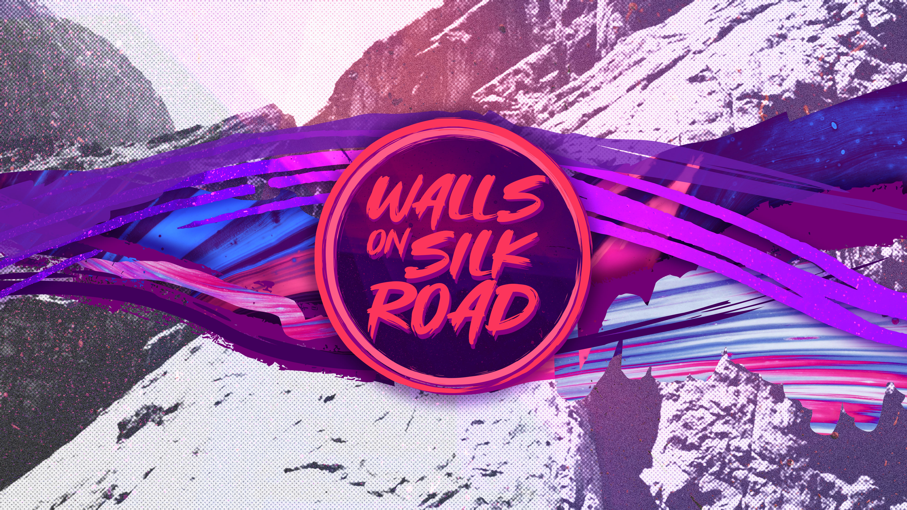
The film follows a group of climbers who were aiming to make first ascents on a series of cliffs that track the path of the old silk road. The brief for the graphics was to be bold and colourful with the main requirements being a 15" intro title, a lower third option and a graphics container option for more detailed content.
Style 001
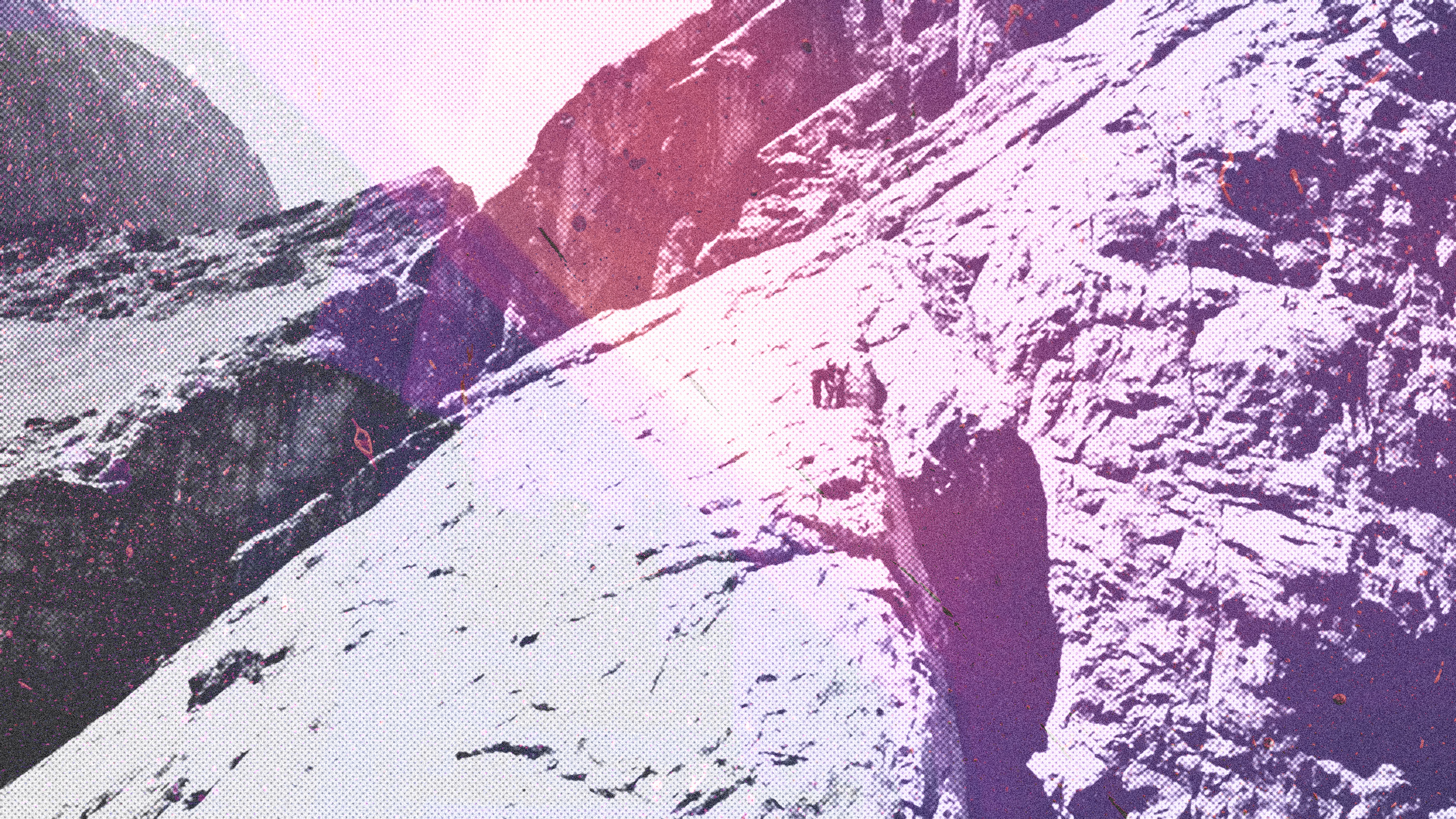
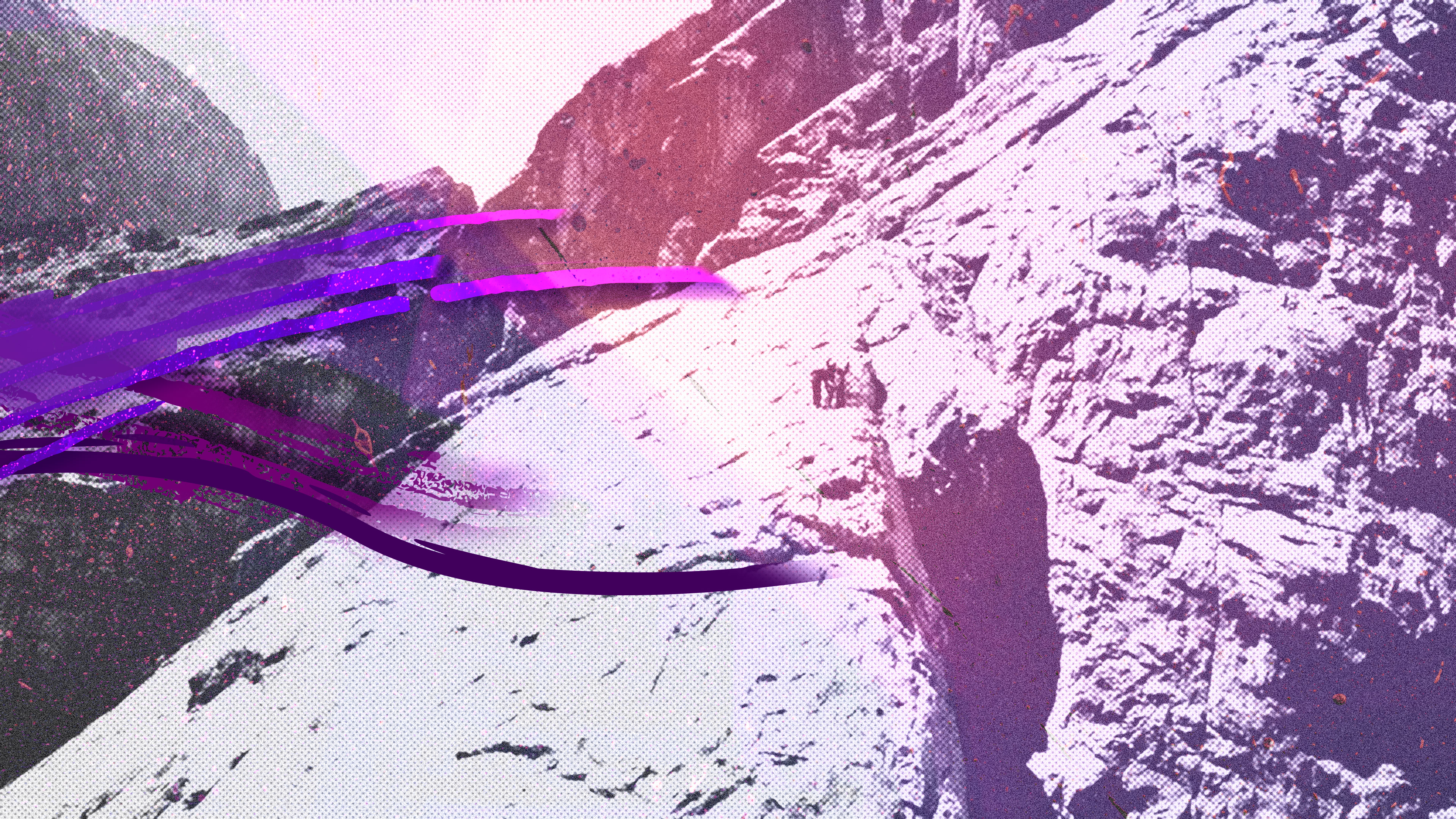
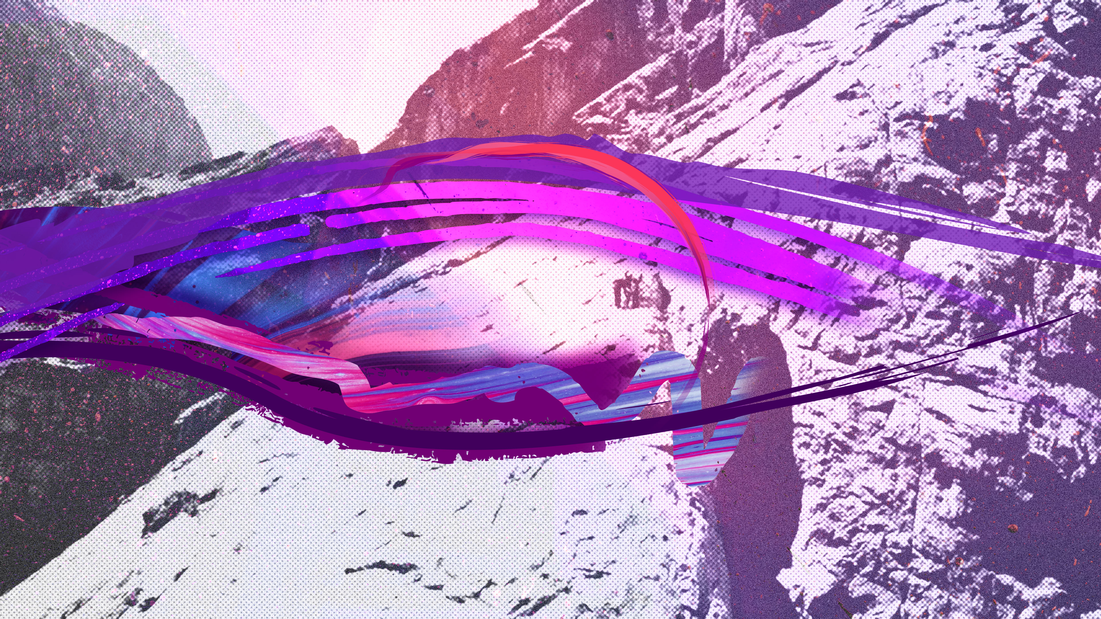
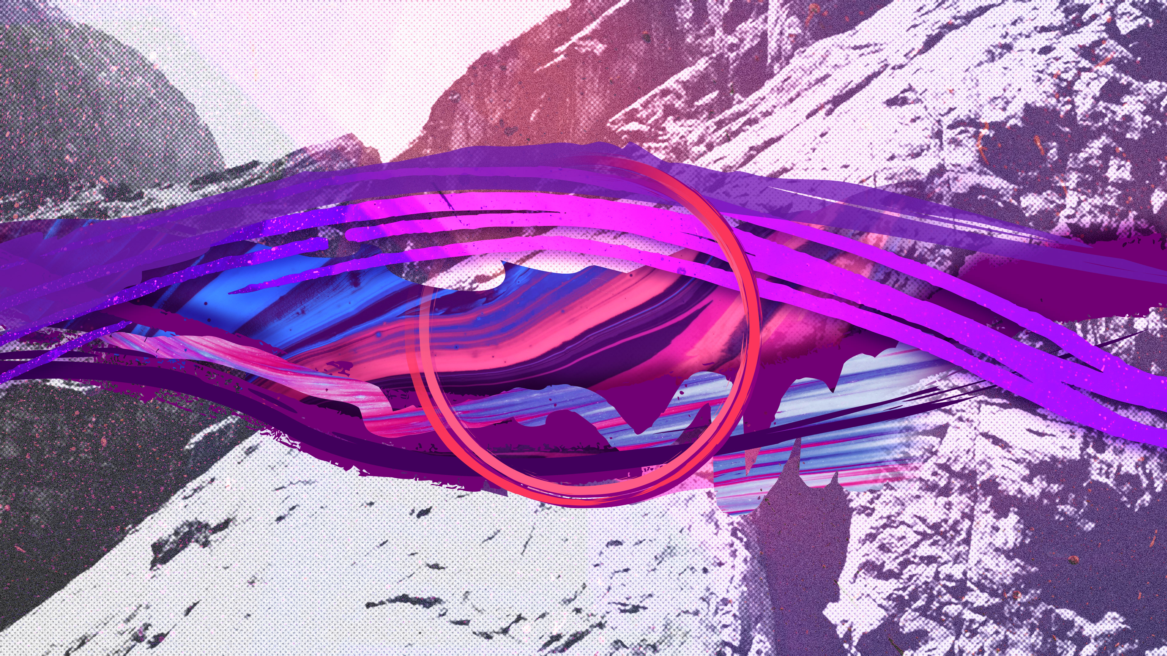
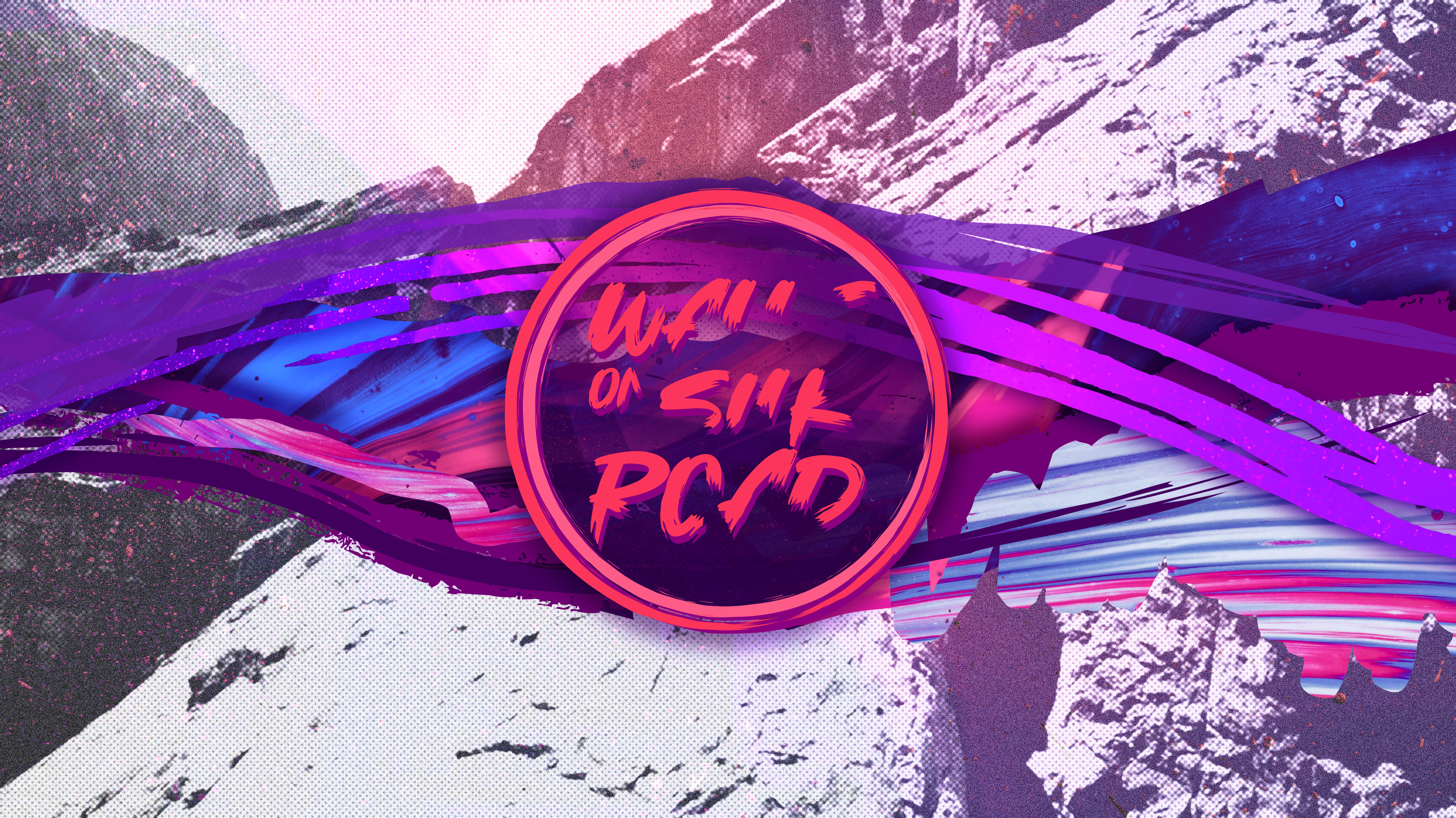
Style one employs a very colourful and graphic style. Brush strokes, ink bleeds and patterns have been used as devices to bring texture to the forefront, infusing each element with depth and dimension. Blending the tones of pink, blue, and purple, the colour palette adds a bit of punch to every visual moment. The font choice, “Slowdex” is designed to compliment the rest of the elements.
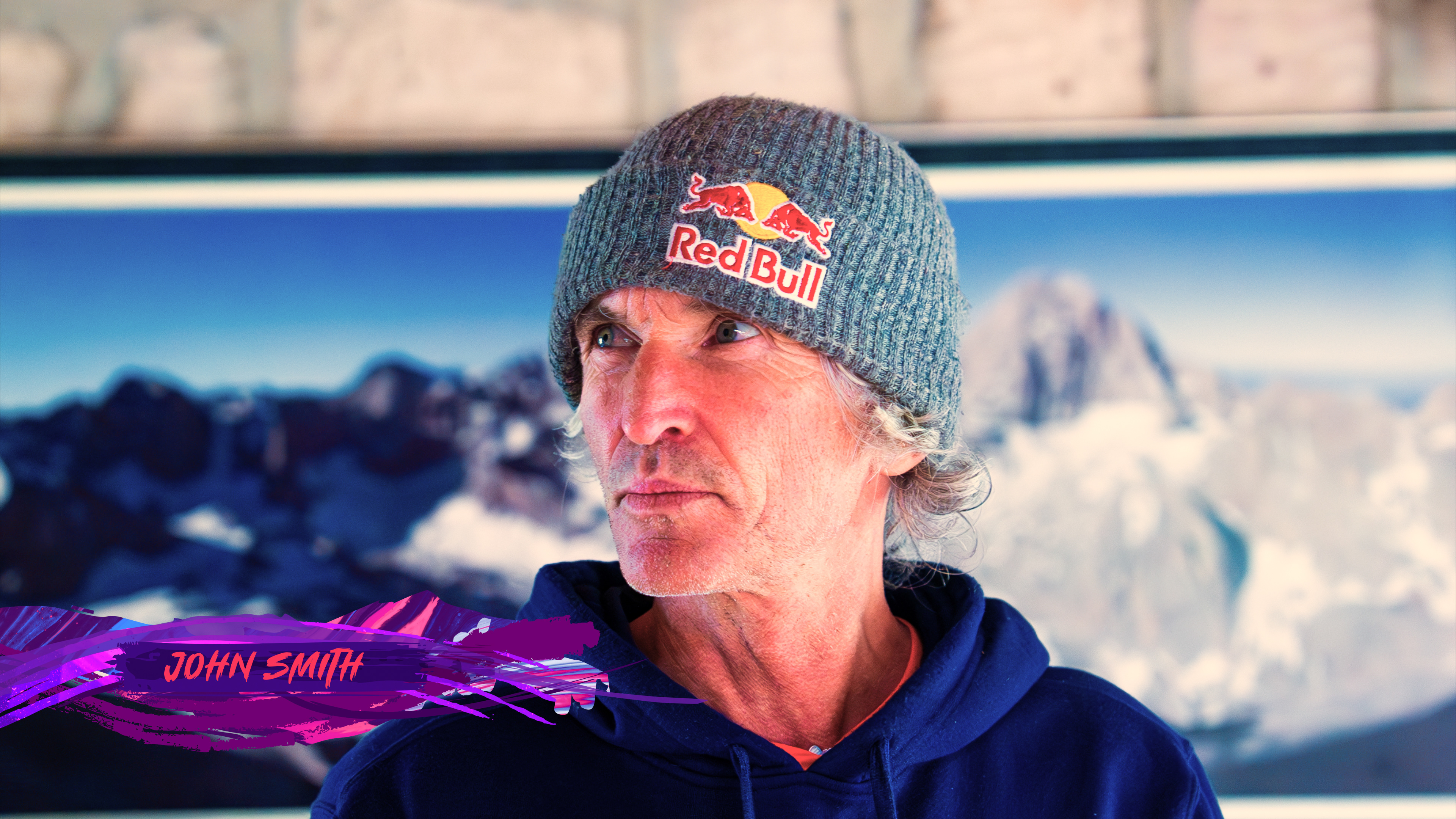
Style 001
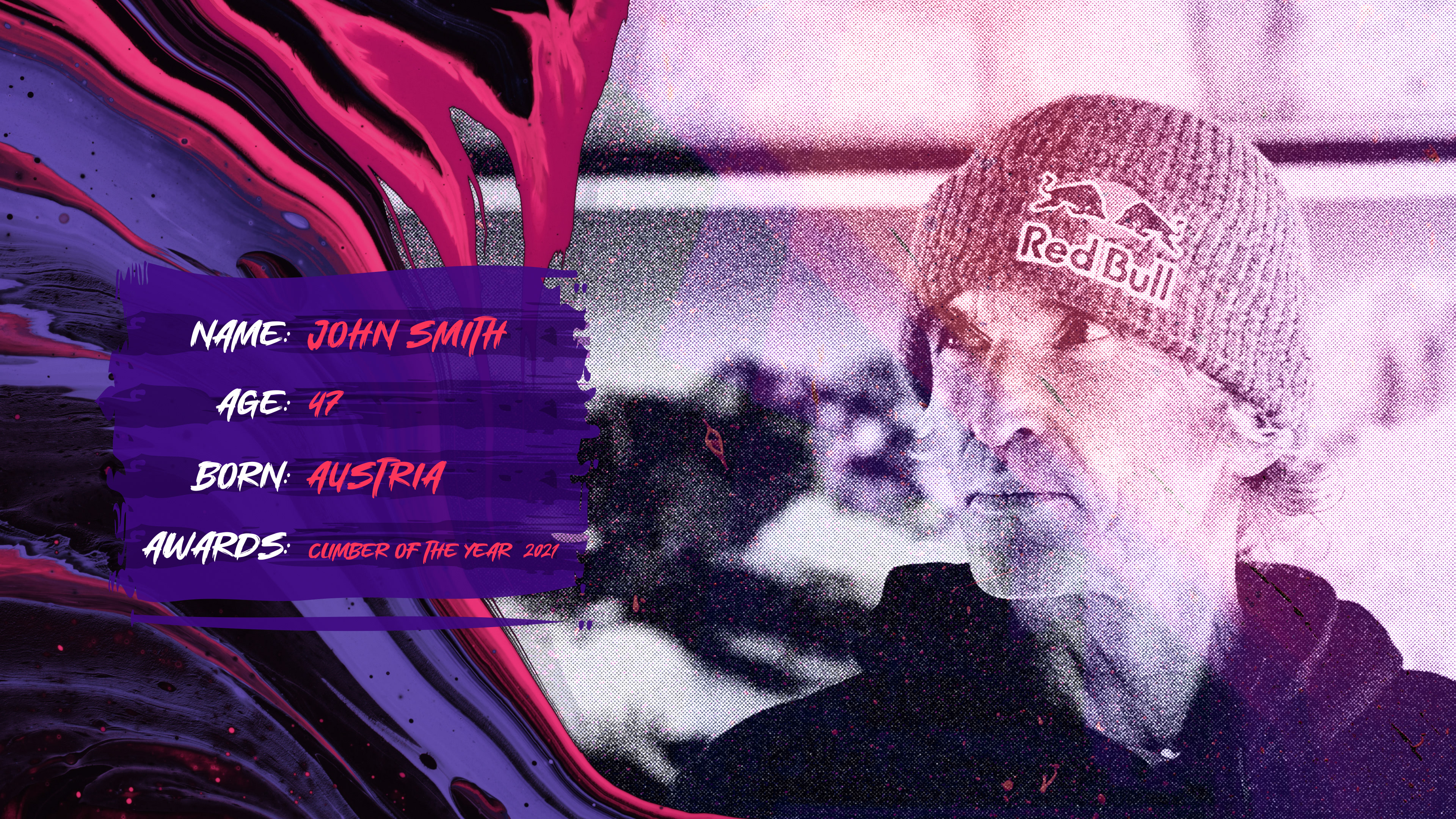
These supporting elements were designed to tie the graphics package together and provide a place for information to live.
Style 002
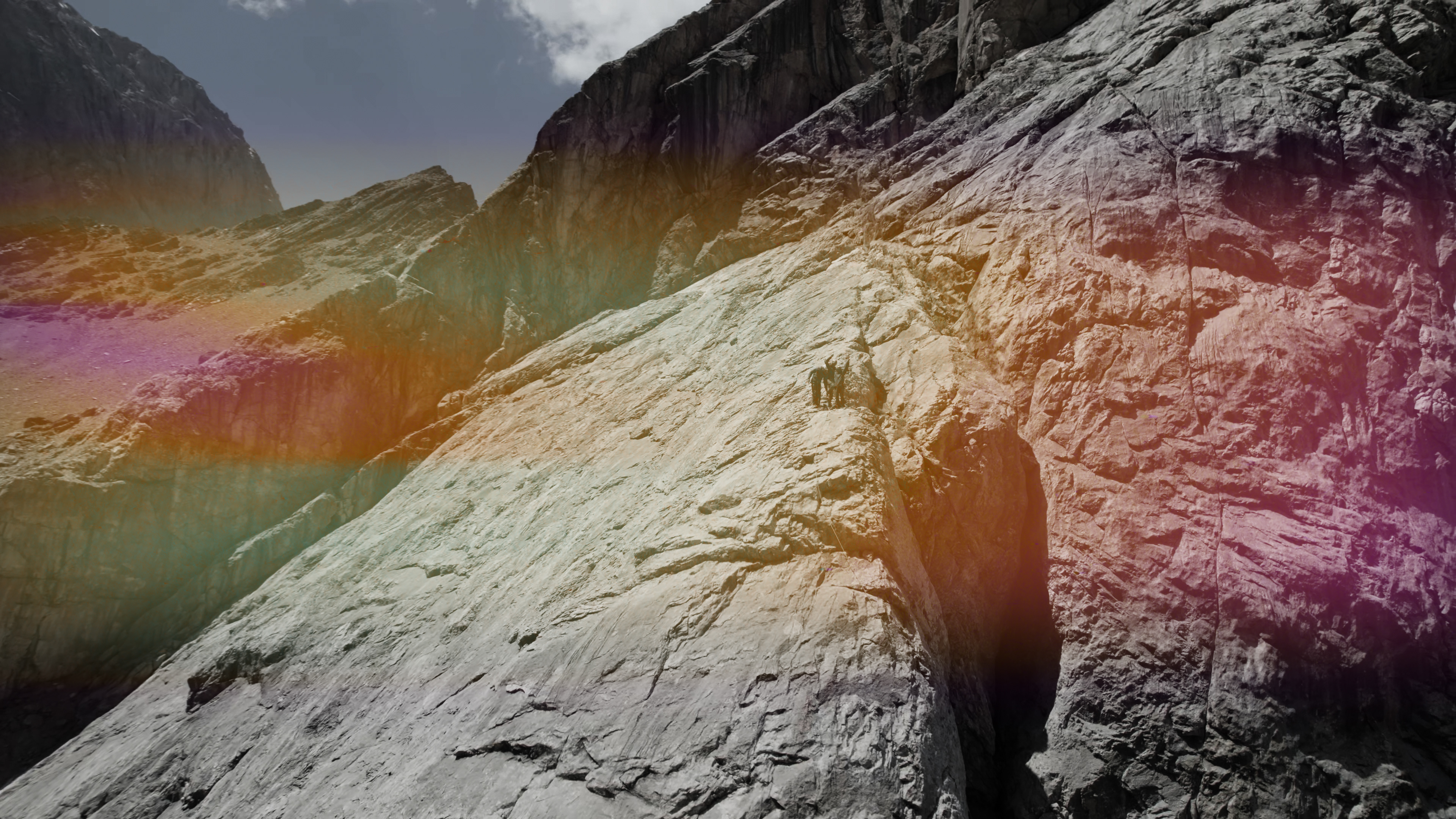
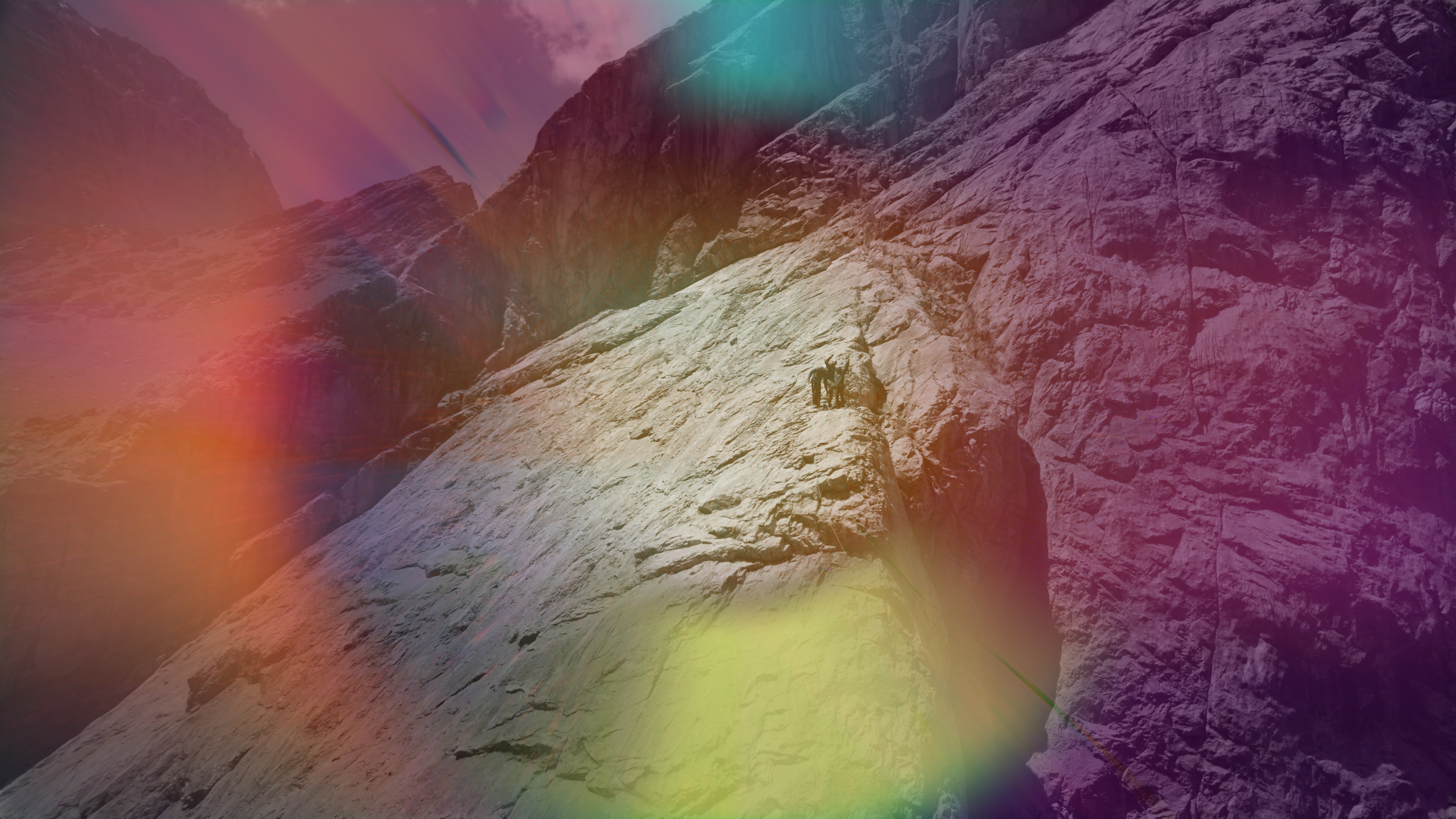
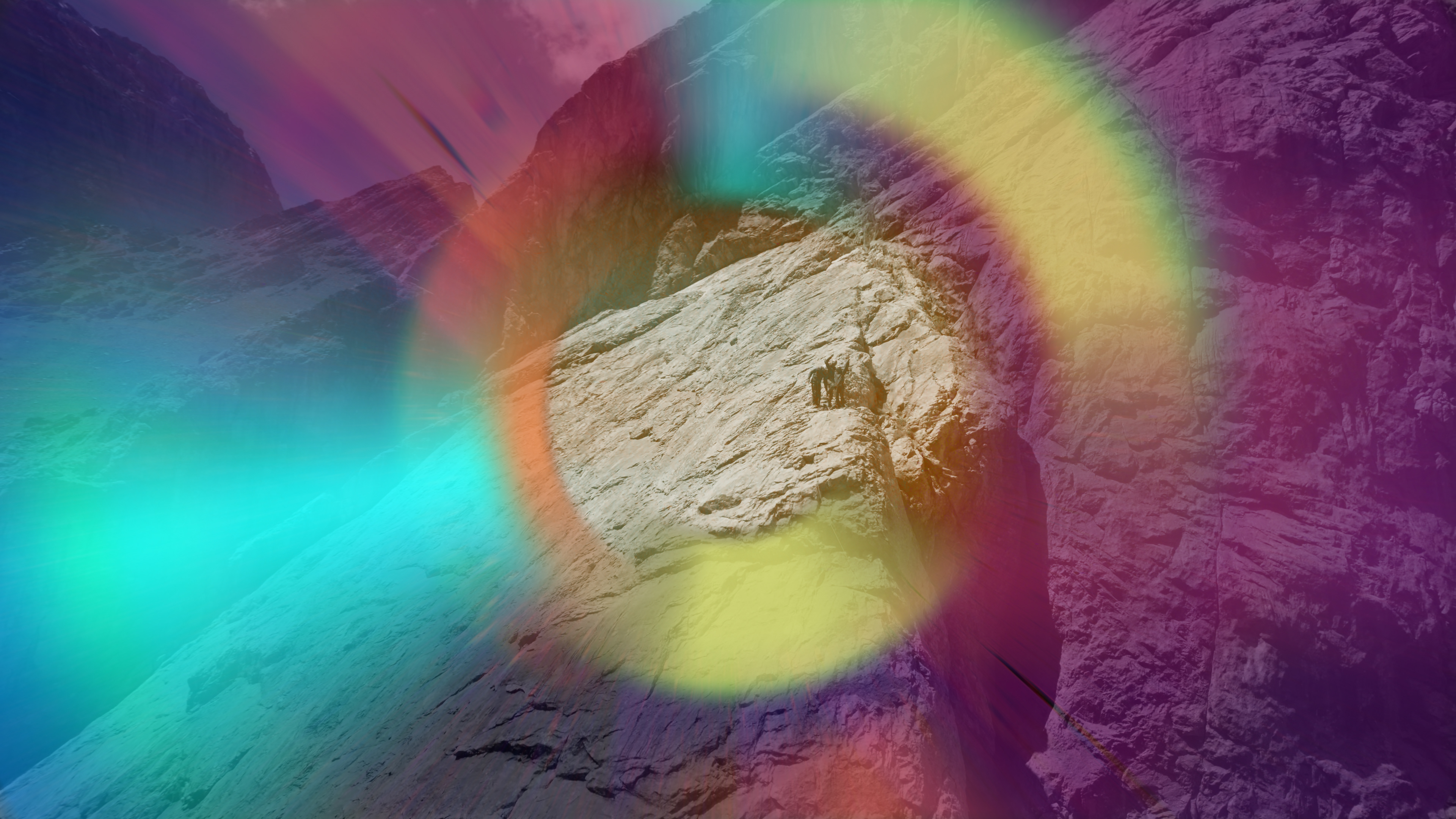
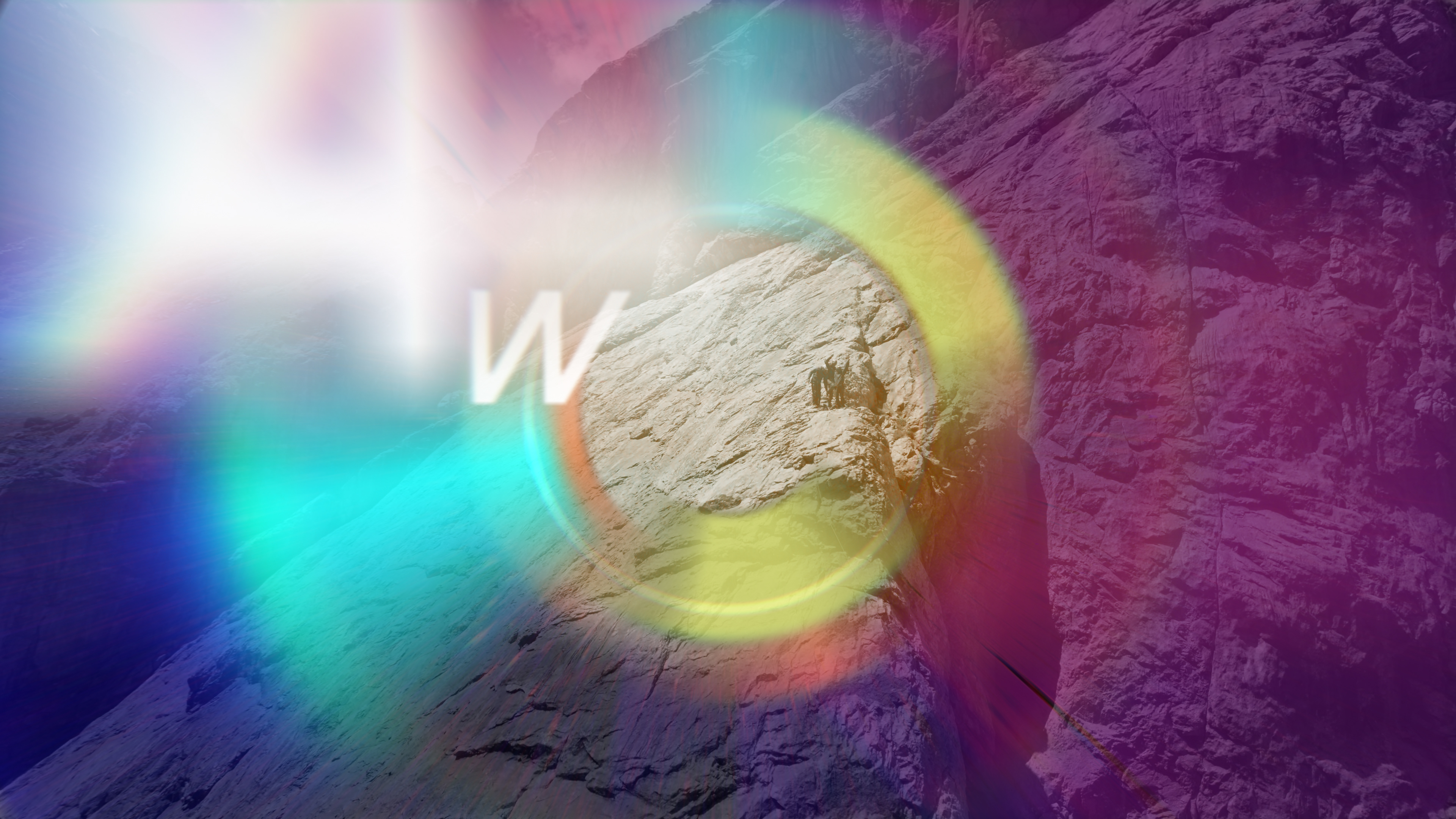
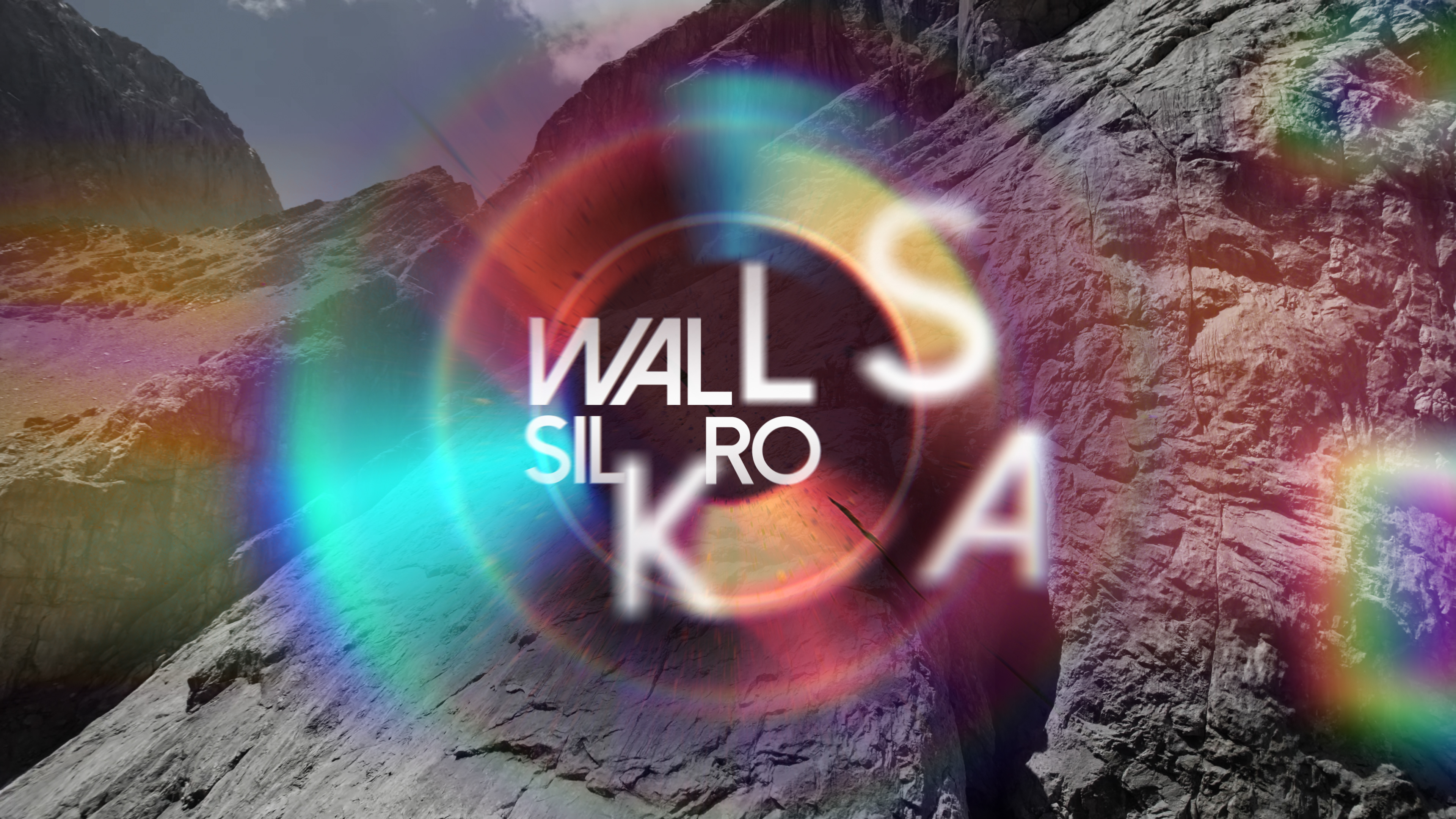
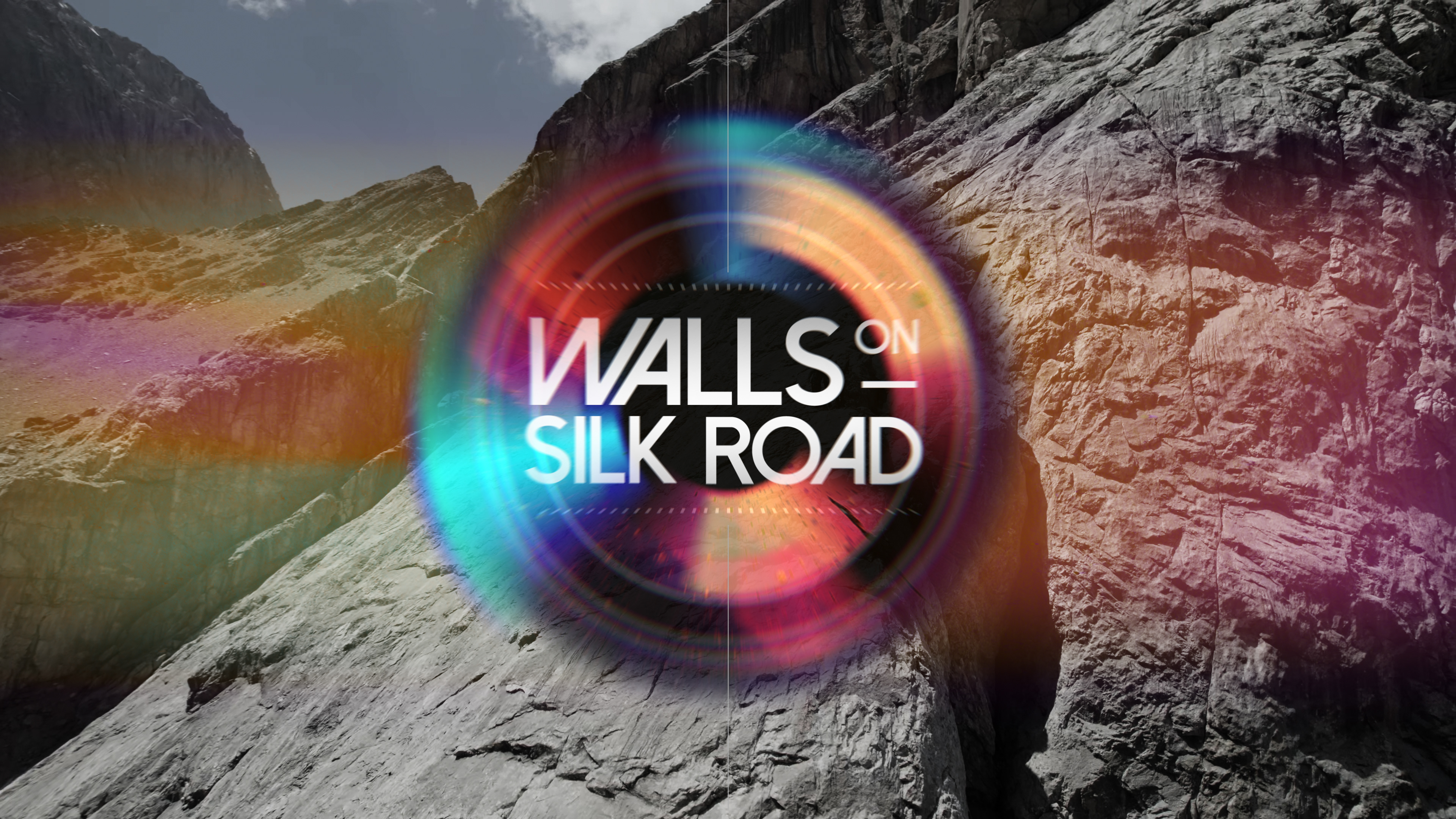
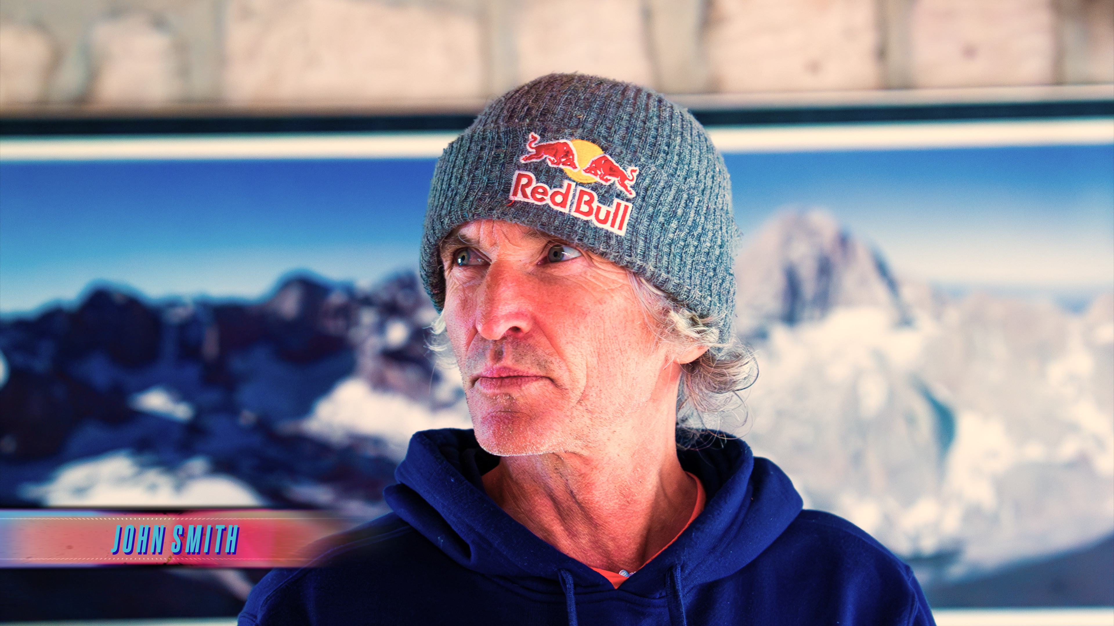
Style two centres around a more optical approach. Using depth of field, motion blur and chromatic abberation to build a cohesive series of elements that house a clean block of typography and some subtle UI style elements. This is a clean and elegant approach hence the font choice of “Dolce Vita” and a slightly more muted colour palette.

Style 002
These supporting elements were designed to tie the graphics package together and provide a place for information to live.
